The short briefing checklist
Before requesting a project review, collect:
- the approved logo, wordmark, monogram or letter artwork and its usage rules;
- the campaign purpose and the role the installation should play;
- the feature that must remain recognisable at first glance;
- approximate width, height and depth limits rather than one isolated dimension;
- primary audience and camera positions, plus intended viewing distances;
- freestanding, wall-adjacent, suspended or still-to-be-decided format;
- venue plan, photographs, access route, available height and usable footprint;
- indoor or outdoor context and expected operating period;
- installation, power, rigging and local approval information already available;
- event date, required arrival date, destination and review contacts;
- artwork file status, brand approval route and any fixed colour references;
- reference images that describe the desired presence without implying an unreviewed construction method.
Unknowns can remain open. Label them clearly so the project review can identify the next decisions instead of treating assumptions as approved facts.
Define the job before choosing the object
The same brand mark can become several different physical experiences. It might act as a landmark above a busy exhibition floor, a freestanding photo moment, a suspended wordmark over a stage, a single symbol at an entry, or a group of letters that frames a retail activation.
Begin the brief with an audience action and a campaign role:
- Notice: the installation should be recognised early from a long approach.
- Orient: it should help people identify an entrance, zone or destination.
- Gather: it should create a visual focus for a queue, launch or reveal.
- Photograph: it should read clearly from named camera positions.
- Move through or around: it should support circulation without becoming an unplanned obstruction.
- Support a wider environment: it should work with screens, scenic work, retail displays or a stage rather than compete with them.
“Make our logo inflatable” is a starting idea, not a complete brief. “Create a suspended wordmark that identifies the brand zone from the two main entrance aisles and remains legible in wide event photography” gives the review team a usable job to solve.
Choose the brand asset deliberately
Many identity systems contain a primary lockup, secondary lockup, symbol, wordmark, monogram and campaign version. Do not assume that the most complete lockup is the best physical form.
A small descriptor that works on a screen may become visually weak, structurally awkward or unnecessary in a large object. A symbol may carry recognition on its own at a distance. Separate letters may offer a stronger spatial rhythm than a single connected panel. Conversely, separating an intentionally connected wordmark can damage the identity.
Ask the brand team to classify each element:
Swipe or scroll horizontally to review every column.
| Element | Approval status | Physical priority | May be simplified? | Must remain fixed? |
|---|---|---|---|---|
| Primary symbol | Approved master | Recognition from approach | Only with brand approval | Overall silhouette and proportions |
| Wordmark | Approved master | Brand name in front views | Case by case | Letter sequence and core spacing relationship |
| Descriptor | Campaign option | Close-view context | Often a candidate for a printed treatment or omission | Wording and brand rules if used |
| Colour fields | Approved palette | Recognition and photography | Subject to material, print and sample review | Named reference and intended hierarchy |
| Registration marks | Artwork detail | Production alignment | Not audience-facing | Final mapped placement |
This is not permission to redesign the identity. It is a way to identify where physical interpretation needs an explicit brand decision.
Decide between a symbol, separate letters and a combined lockup
The format should follow the brand asset and the venue, not a generic preference.
Swipe or scroll horizontally to review every column.
| Format | Useful when | Questions to resolve |
|---|---|---|
| Single three-dimensional symbol | One recognisable icon can carry the brand moment; the installation needs a strong silhouette from several directions | Does the side profile still read? Which face is primary? How much depth supports the intended presence? |
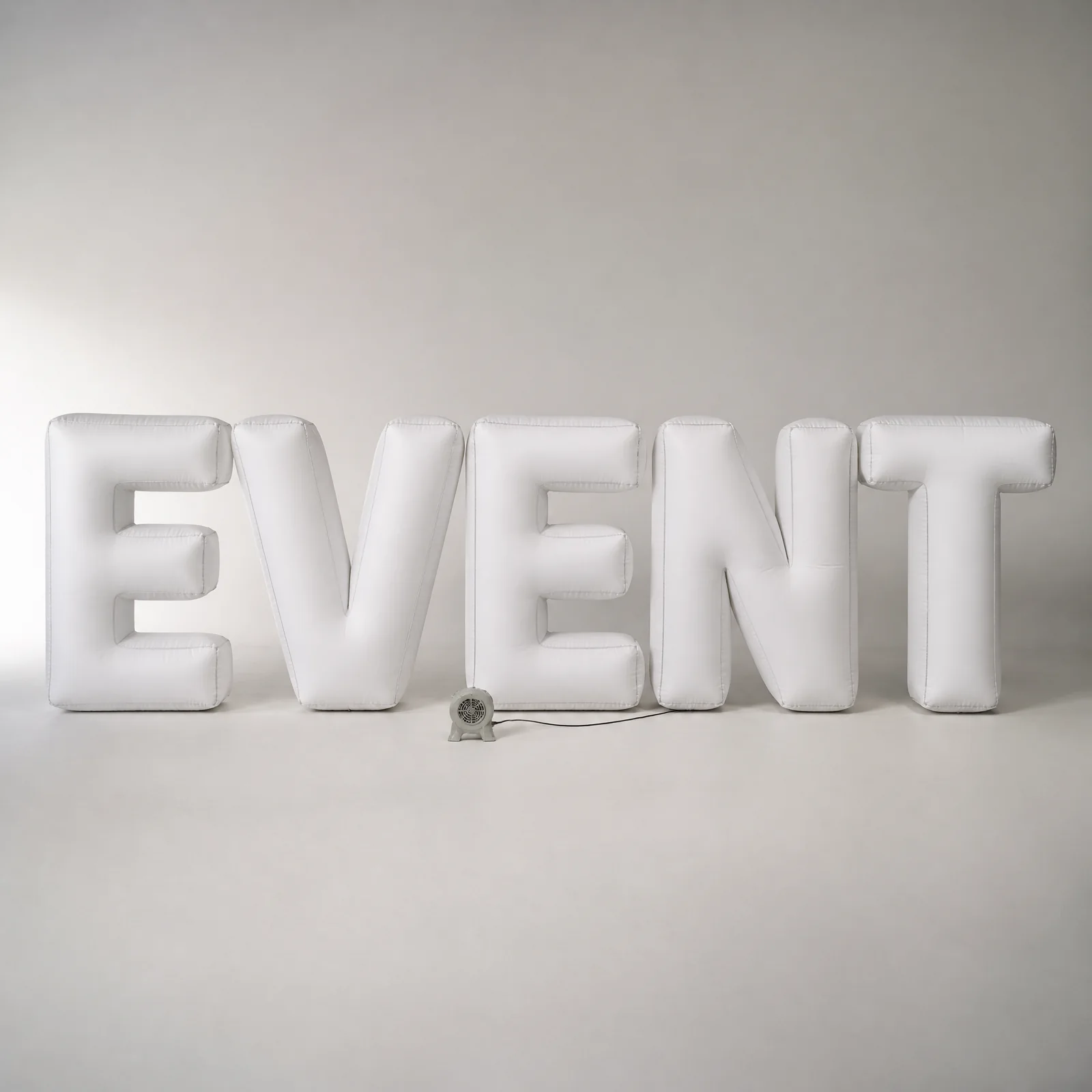
| Separate letters | The word itself is the hero; spacing and rhythm can work as part of the environment | How will spacing be controlled onsite? Are all letters stable or supported in the selected arrangement? Which letters contain delicate counters or strokes? |
| Connected wordmark form | The identity depends on a fixed relationship between letters or a continuous gesture | Where can connections sit without changing recognition? Does the form read from off-axis views? |
| Symbol plus wordmark | Both elements are needed for recognition or campaign compliance | Should they be one assembly or separately positioned? Which element leads at distance? How is their spacing controlled? |
| Printed logo on a larger form | The logo needs to appear clearly, but its exact letter geometry is not suited to becoming the whole volume | What is the viewing surface? How will curved-surface distortion be reviewed? Is the surrounding form appropriate to the campaign? |
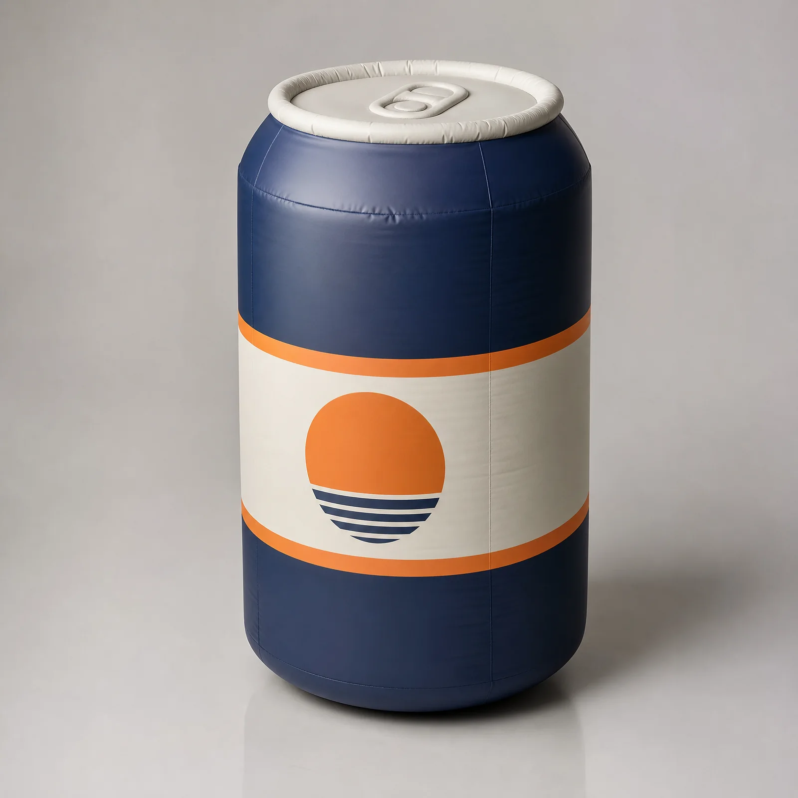
InflatPro's three-dimensional logo symbol page is the relevant product route when the mark itself becomes a sculptural form. For overhead wordmarks and letter groups, review suspended inflatable letters. These pages establish format context; the final approach still requires a project-specific review.
Protect recognition by naming the non-negotiable features
Inflatable volume changes how a flat mark behaves. Thickness, seams, curved surfaces, softened corners and internal pressure can alter the appearance of a stroke or opening. The brief should identify the features that carry recognition before a three-dimensional interpretation begins.
For a symbol, those features may include an outer contour, an internal cut-out, a directional angle, a distinctive corner or the relationship between two colour blocks. For letters, they may include stroke contrast, counters, terminals, spacing, baseline or the relationship between uppercase and lowercase forms.
Use a recognition hierarchy:
- Must preserve: a change would make the mark incorrect or unrecognisable.
- May be interpreted: the physical version can adapt this detail if the brand team reviews the result.
- May move to surface artwork: the detail does not need to be a separate volume.
- May be omitted for this application: the approved event version can work without it.
Include the master artwork and a marked-up copy showing this hierarchy. That is more useful than asking the project team to infer brand priorities from a style guide alone.
Review counters, gaps and thin strokes early
Letters and symbols often contain counters—the enclosed or partly enclosed spaces inside forms such as A, B, D, O, P and R. Other marks depend on narrow slots, acute corners or small gaps between elements. These details need early attention because a physical volume occupies space on both sides of the flat outline.
Do not solve the issue by applying one universal minimum thickness. The appropriate interpretation depends on overall scale, material and construction approach, viewing distance, inflation method, installation orientation and the visual tolerance of the brand.
Instead, ask for a focused review of:
- the smallest counter or negative space;
- the thinnest important stroke;
- the narrowest separation between neighbouring forms;
- tight inside corners;
- overlapping or nested colour areas;
- small extensions that carry recognition;
- shapes that may appear different when viewed from the side.
If one of these features is critical, include it in the approval gates. A developed view or relevant physical sample can address the decision more clearly than relying on a flat logo file.
Brief an envelope, not one dimension
“Three metres wide” does not define the physical result. Width, height and depth work together, and the correct relationship depends on the intended view and the available space.
Provide an approximate envelope:
Swipe or scroll horizontally to review every column.
| Input | What to describe |
|---|---|
| Maximum width | Available span, neighbouring objects and clearance limits |
| Maximum height | Venue clear height, intended sightline and any overhead constraints |
| Preferred depth | Desired sculptural presence, side visibility and available footprint |
| Base or support zone | Space that may be occupied by the form, equipment or project-specific support solution |
| Audience clearance | The circulation or controlled area required by the event and venue plan |
| Camera field | The positions and frame sizes in which the mark should remain readable |
If the envelope is provisional, say which venue fact will confirm it. The project team can then distinguish a visual target from a fixed site limit.
Map the real viewing and photography positions
A logo can be correct from the front and weak from the route most people actually use. Add a simple venue plan or annotated photograph showing:
- main audience approaches;
- longest important view;
- close interaction area;
- primary photographer or camera positions;
- screen, stage or retail sightlines;
- views that may be blocked by people, furniture or other production elements;
- any side or rear view that will appear in public photography.
Then assign a priority to each view. A suspended wordmark may need to read from two opposite aisles. A freestanding symbol may need a strong three-quarter silhouette. A stage-side mark may be optimised for the broadcast or hero-camera position while still appearing intentional to the live audience.
Avoid describing every direction as equally important unless the venue genuinely requires it. Priorities help the physical form allocate detail where it will be seen.
Separate volumetric shape from mapped artwork
The physical outline and the printed or applied artwork are related but different approval objects. A colour division that appears straight in a flat file may cross a rounded edge. A wordmark printed onto a larger inflatable surface may distort if it is approved only in a flat elevation.
Review the guide to adapting artwork for a curved inflatable surface when the project uses mapped graphics. Provide vector artwork where available, linked assets, fonts or outlined type according to the agreed handoff, and the relevant colour references. Do not treat a screen rendering as an exact physical colour guarantee.
The artwork review should show:
- the intended front, side and rear placement;
- where important details approach seams, edges or changes in curvature;
- which elements wrap around the volume;
- which content is intended for long-distance recognition;
- which small content is optional or for close viewing;
- the orientation of each repeated letter or symbol;
- the approved relationship between physical shape and surface graphics.
Decide whether the installation is freestanding or suspended
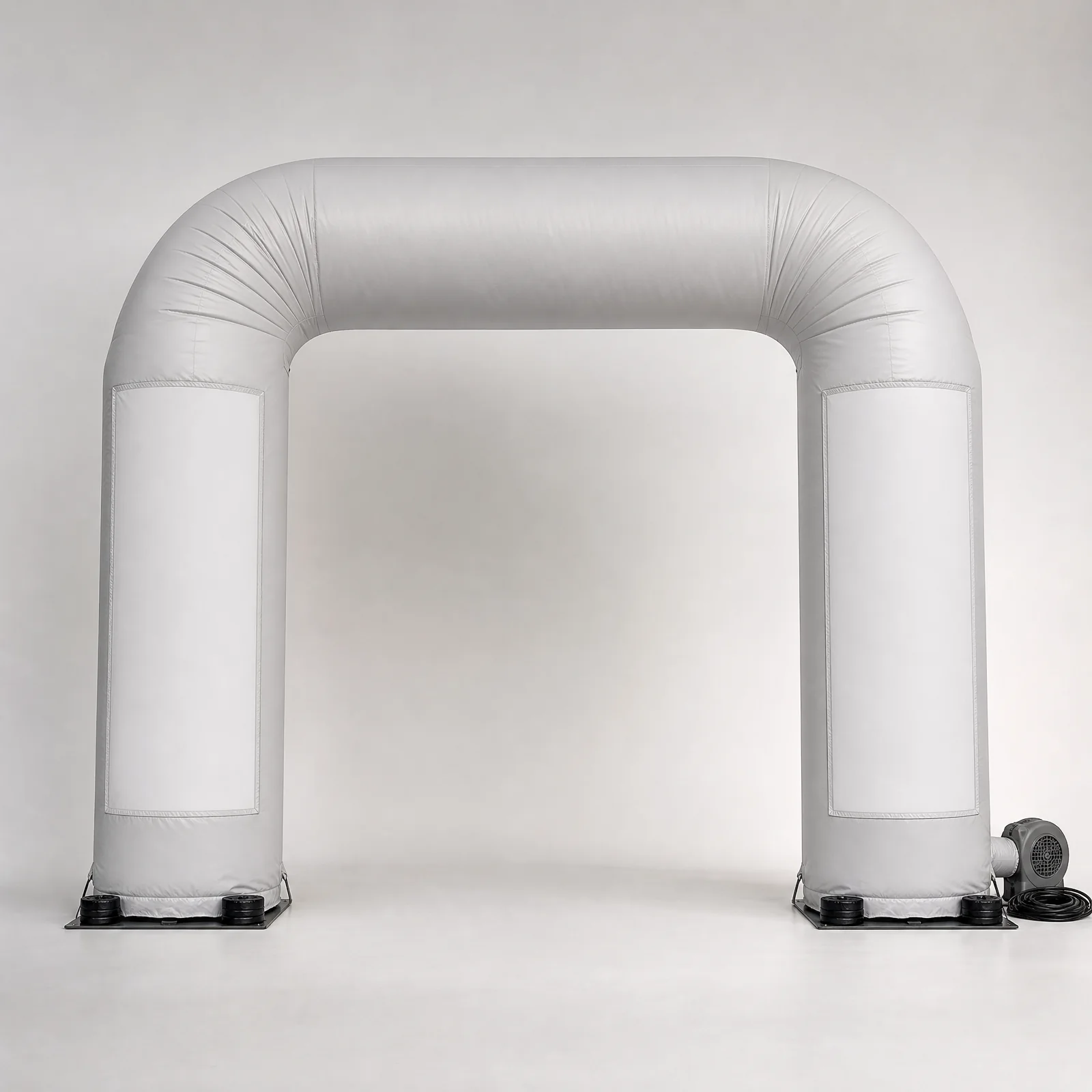
Freestanding and suspended formats create different site interfaces. The creative brief should name the preferred mode, but it should not pre-approve a rigging, stability or operating solution.
Freestanding or floor-positioned
Provide the usable footprint, floor or ground information, public proximity, surrounding circulation, nearby structures and the event's approach to controlled areas. Identify who will review the final site conditions and any anchoring, ballast, barriers, supervision or operating requirements.
Suspended
Provide the available clear height, intended elevation, known rigging points or venue rigging process, access equipment constraints, installation window and the venue contact responsible for the overhead review. The appointed venue and rigging teams must decide the actual suspension method and approval requirements for the location.
Still undecided
If both options remain possible, show the creative and site reason for each. The initial review can compare how they affect visibility, footprint, access, equipment and responsibility without claiming that either format is approved.
Make venue information part of the creative brief
Venue facts are not an administrative appendix. They influence proportion, orientation, access, installation sequence and what the audience will see.
Include, where available:
- plan, elevations and recent photographs;
- usable floor area and clear height;
- door, corridor, lift and loading access;
- stage, screen, lighting and neighbouring scenic positions;
- audience route and controlled-area plan;
- available setup and removal windows;
- indoor or outdoor context and site exposure;
- known power location and venue electrical process;
- rigging information or the venue's route for requesting it;
- floor, ground or supporting-condition information;
- venue forms, submission deadlines and named reviewers;
- local labour, lifting, access-equipment and supervision arrangements already decided.
If the venue pack is incomplete, use the site assessment checklist for large inflatable installations to structure the open questions. The purpose is to make dependencies visible, not to have the agency approve technical work outside its role.
Use distinct approval gates
“Logo approved” can mean several different things. A controlled review path separates them.
Swipe or scroll horizontally to review every column.
| Gate | Decision | Useful review material | What remains open |
|---|---|---|---|
| Brand asset | Which approved mark and usage rules apply | Master files, brand guide, marked priority copy | Physical interpretation |
| Overall form | Whether silhouette, volume and main proportions express the mark | Multi-view concept or developed views | Production details and final site interfaces |
| Venue fit | Whether the proposed envelope and orientation suit the current site information | Plan overlay, approximate dimensions, priority views | Local technical and venue approval |
| Artwork mapping | Whether colour blocks, logos and surface content sit correctly on the developed form | Mapped artwork views and relevant references | Physical colour outcome within the agreed review method |
| Production evidence | Whether agreed visible checkpoints have been addressed before packing | Project-specific photos, video, measurements or checklist evidence as defined in scope | Site acceptance and onsite conditions |
| Handover | Whether packages, equipment information and setup material match the agreed scope | Packing identification, equipment list and handover documents | Local installation execution and venue decisions |
Record who reviews each gate, what the approval covers and which later decisions it does not cover. A brand approval should not silently become a venue or engineering approval.
Issue a briefing pack that another team can use
A workable first-review pack can be concise:
- One-page project summary: campaign purpose, audience moment, format preference, event date, required arrival date and destination.
- Brand asset folder: current master artwork, relevant brand rules and the marked recognition hierarchy.
- Venue folder: plan, photographs, access information, clear height, usable footprint and named open questions.
- Viewing map: audience approaches, priority views and camera positions.
- Envelope note: approximate width, height and depth, plus which limits are fixed or provisional.
- Responsibility note: current expectations for delivery, installation, rigging, power, operation, supervision and removal.
- Approval list: decision makers, required review stages and any fixed brand or venue deadlines.
- Reference set: visual references with a note explaining what each reference communicates—scale, softness, suspension, finish, atmosphere or another quality.
Use InflatPro's brand activation page to place the logo installation in its wider campaign role, and the marketing-agency project context page when the installation is one part of a larger client programme.
Common briefing mistakes
Pause and clarify the brief when it:
- supplies several logo versions without naming the approved asset;
- gives one desired dimension but no depth, venue envelope or viewing position;
- asks for exact reproduction while leaving critical counters or fine details unprioritised;
- treats a front elevation as proof that side and three-quarter views will work;
- assumes a printed wordmark and a volumetric wordmark are the same design task;
- specifies suspension without venue height, rigging process or responsible reviewer;
- specifies freestanding outdoor use without the actual site or local operating plan;
- requests “brand colours” without providing the applicable reference and approval route;
- uses a mood image as though it defines construction, equipment or technical acceptance;
- combines brand, creative, venue and production approval into one undefined sign-off;
- omits delivery point, access route, installation window or local responsibilities;
- expects the final event date alone to function as a production and approval programme.
These are not reasons to stop a project. They are signals that the next review should convert an assumption into a named decision.
Request a project review
InflatPro supports agencies and brand teams developing premium custom inflatable brand moments, including three-dimensional logo symbols, letter installations, branded environments, product replicas, characters and large event features.
For an initial review, share:
- the logo, wordmark or symbol to be interpreted;
- the campaign purpose and intended audience moment;
- approximate width, height and depth or the available venue envelope;
- priority viewing and camera positions;
- freestanding, suspended or undecided installation preference;
- indoor or outdoor venue information, access and known site constraints;
- event date, required arrival date and destination;
- reference images, sketches and current artwork files;
- the brand and venue approval contacts;
- expected delivery, installation and local-team responsibilities.
Request a Project Review. Open technical and venue decisions can remain open when their owners and next review steps are clear.