Primary Markets / 6 pages
Primary Markets
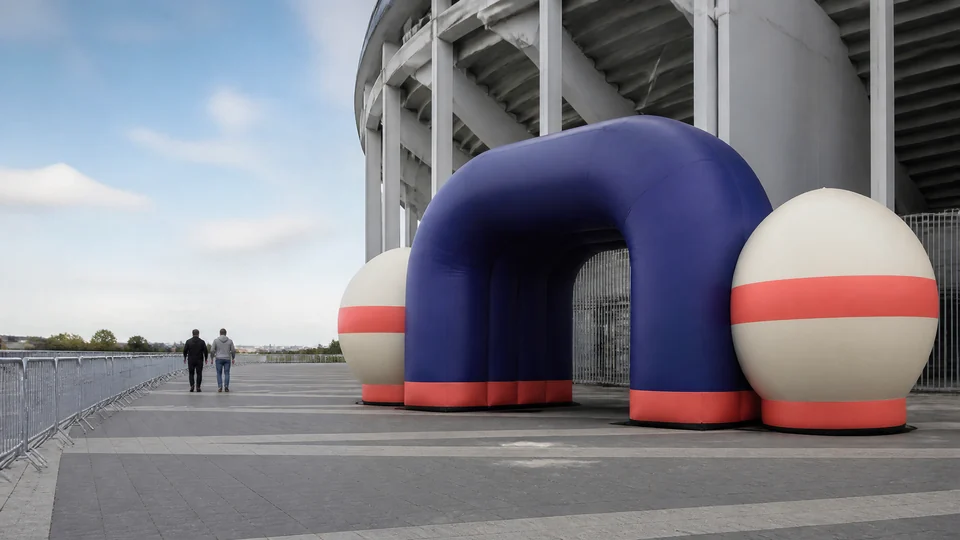
 Concept visual · Design reference only
United States
U.S. projects often need the installation to read across wide venues, camera angles, and fast-moving audience flow, so the review has to protect both scale and legibility.
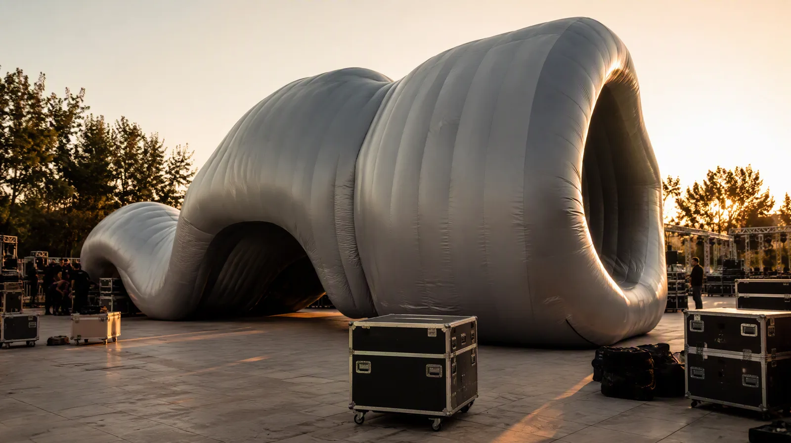
Explore Market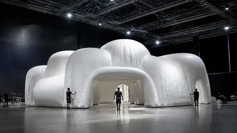 Concept visual · Design reference only
United Kingdom
The strongest direction usually comes from keeping the creative idea crisp while the venue, crowd flow, and delivery path stay visible in the same review.
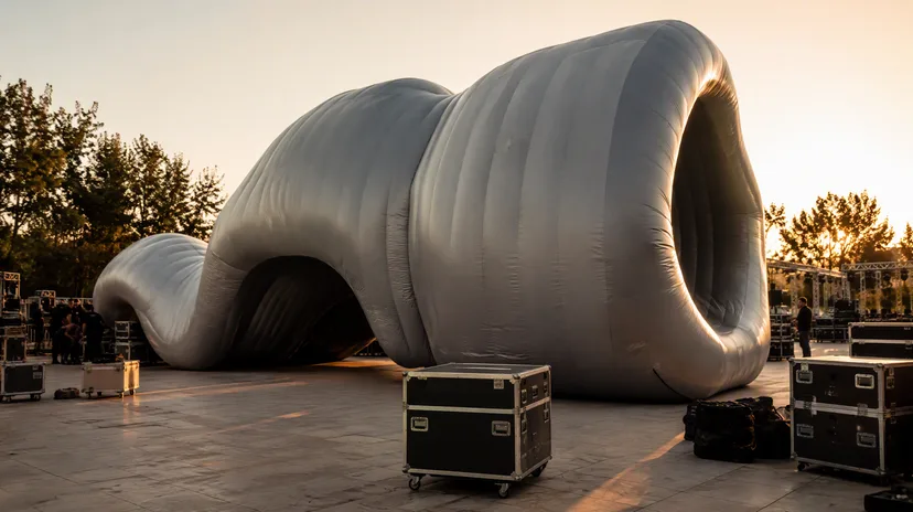
Explore Market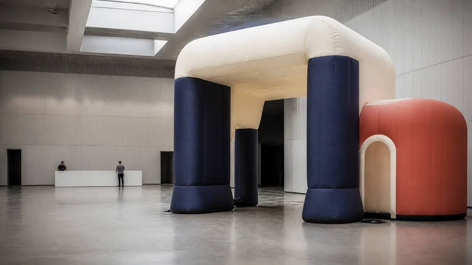 Concept visual · Design reference only
Canada
The useful conversation is about how a form behaves in a specific venue, not simply whether it can be transported into the country.
Explore Market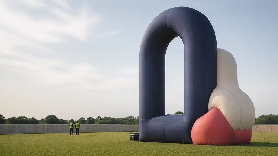 Concept visual · Design reference only
Australia
The work needs to stay legible across outdoor conditions, crowd movement, and camera distance while the campaign direction remains editorial rather than promotional.
Explore Market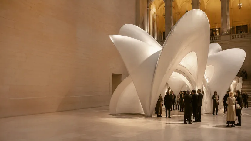 Concept visual · Design reference only
France
The page is written for teams that need the installation to feel considered, composed, and visually precise rather than loud for its own sake.
Explore Market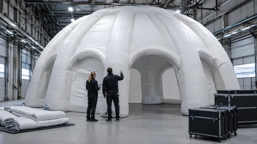 Concept visual · Design reference only
Germany
The strongest page language is precise rather than expansive, with an emphasis on venue realities and how the work supports the event structure.
Explore Market