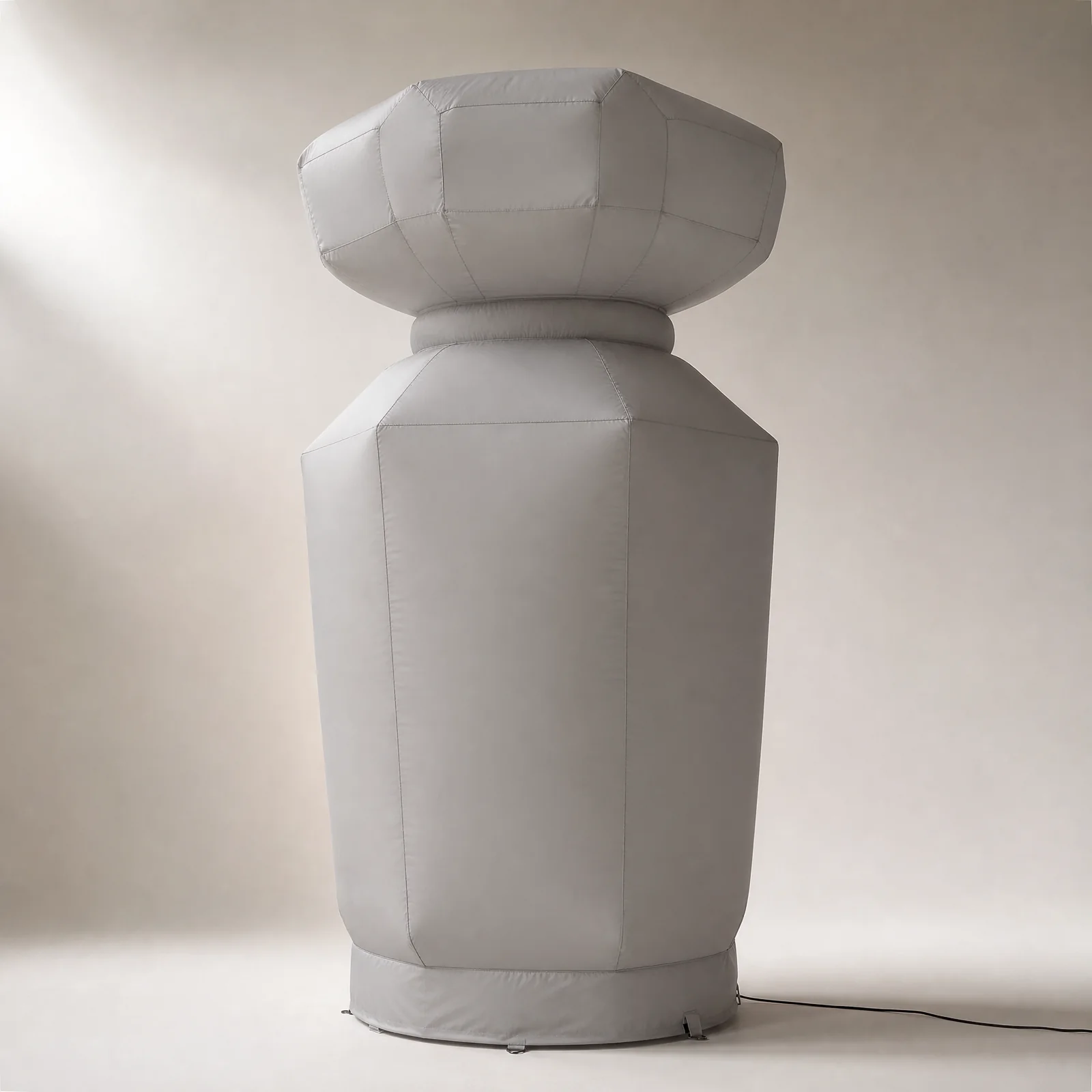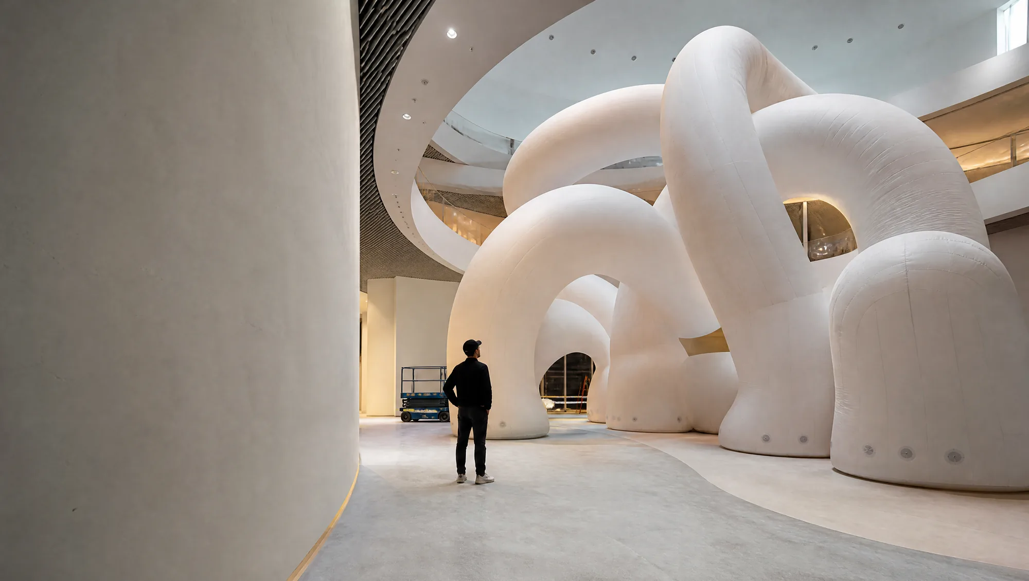
Read the Architecture Before Fixing the Scale
Atrium height, balconies, glazing, escalators, columns, and upper-level views all change how a large form is perceived. A concept that feels monumental in a neutral image may read differently beside a busy retail interior.
A useful review maps the principal approach views and identifies where the campaign needs recognition, photography, or a more intimate close-range moment.
Protect Customer Movement and the Immediate Experience
Retail campaigns need the installation to work with existing movement, not simply occupy the largest open area. Consider circulation around the form, adjacent entrances, queueing, sightlines to nearby destinations, and the audience distance at which the main visual should be understood.
This review helps distinguish a visually large direction from one that is physically oversized for the available customer path.
Review the Arrival Path to the Final Position
The final location is only one part of the project. Loading entrances, lifts, service corridors, time windows, and the route to the retail floor should be recorded while the direction can still respond to them.
The project review can then identify which size, form, and packing assumptions remain open rather than treating a presentation image as an execution plan.
Hold the Brand Hierarchy at Every Viewing Distance
A large form may be photographed from a distance and examined from close range. The essential visual cue should stay clear across those two conditions, while secondary detail is placed where it will not compete with the overall form.
Artwork, material direction, lighting intent, and the surrounding architecture need to be reviewed as a single visual system.